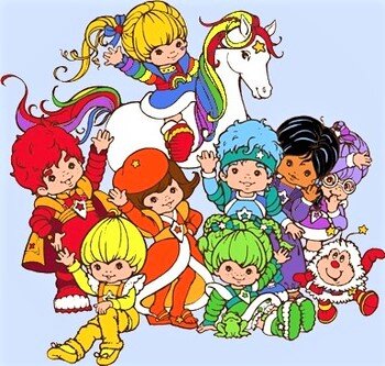
I have watched several artists tackle the “One Color Challenge” online and, because I adore color, I figured it was time to take on the challenge myself! I wanted to do a variation on the theme and instead of using every art supply of that color on a piece, I chose to limit myself to 4-5 watercolors of the same hue and create a portrait for each color. I have been wanting to do my own take on the Rainbow Brite franchise for some time, as I grew up with the series and had all of the dolls (because, c’mon: Rainbow). However, I didn’t want to directly copy the designs, mainly because they’re not my style. I instead selected a few royalty free portraits online and assigned a color to each one. Here’s how that turned out:

Red Butler: You’ll notice that all of the models in here are either women, trans women, or non-binary folk. Red’s character in the original series was prone to bragging about his adventures or rescuing anyone in distress. I opted to make Red a Victorian woman quietly poised for a spot of tea. Her hair was painted with Perylene Maroon (Holbein) and I sprinkled in some Burnt Sienna Brusho for texture. Her skin is mottled with Winsor and Newton’s Potter’s Pink, her dress is painted with Quinacridone Red (Daniel Smith), and I used Da Vinci Red for the cuffs. While most of the original 1980s outfit is gone, I incorporated Red’s golden arched shoulder pads and star crest as a brooch. Her expression is my favorite among the portraits-slightly arch, but inviting.

La La Orange: Fashion-forward and romantic, the original La La Orange sports a long dress and leggings. Since I wouldn’t be able to show much of that in the three-quarter portrait, I decided to keep her saucy beret and the star insignia. That’s where the similarities end. This non-binary model had an edgy leather theme I liked , so I used Transparent Orange (Qor) on the bodice, Quinacridone Burnt orange on the beret, and a different Transparent Orange (Jazper Stardust) for the skin, very watered down for a lighter tone. The belts were painted with Piedmont Genuine (Daniel Smith). I’m glad I embraced the messier look for these portraits, as the cauliflowering and back washed areas will continue to pop up in future pieces. I’m still learning to paint inside the lines, but sometimes, I prefer the organic look with color spilling outside its confines.

Canary Yellow: The O.G. yellow kid was cheerful, optimistic, and somewhat naïve. She rocked her golden colored leg warmers, as you do in the 80s. The trans woman I liked for this portrait is anything but naïve. I didn’t want to use a yellow shade for her skin, so I opted for the complimentary violet grey instead (Roman Szmal’s Misty Morning). The dress was painted in Da Vinci’s Gold Ochre and the fluffy sleeves in Roman Szmal Indian Yellow (my favorite cooler yellow). Since the original design included orange, I opted to use it for the wings in front, a call back to the original design. The star shield also makes an appearance. I sprinkled some Yellow Ochre Brusho for a little crackle of texture.

Patty O’ Green: The practical joker of the bunch, Patty was a lover of all things natural, from plants and trees to animals, amphibians, and insects. This natural part of her character inspired me to create a wild, mermaid-esque portrait. While I couldn’t incorporate the green polka-dotted bloomers that is the best part of her outfit, I incorporated those polka-dots on her dress with a Verdigris texture paint. I used a thinned down Compose Green (Holbein) for the skin because the mass tone is very opaque right out of the tube. M. Graham’s yellow tinted Permanent Green Pale is a fantastic color and used in her hair, it mixes wonderfully with cooler greens to amazing effect! I used Da Vinci’s Phthalo Green for hair shadows and their Perylene Green for her dress and band-aids. To create the neat spray effect, I dipped an old toothbrush in masking fluid and used my thumb to ruffle the bristles, spraying the bottom so that the white of the paper could be uncovered later as sea spray! I’m definitely using this technique again for stars in a sky or water effects.

Buddy Blue: Sports fanatic and meditation extraordinaire, Buddy brings peace to conflict and spandex to the team. I included the exaggerated arches and star headband from the original design. Anthraquinone Blue (M. Graham) was used for her hair, Copper Turquoise for her skin (Jazper Stardust), and Cobalt Teal (Da Vinci) for the shoulder arches. I wanted a non-granulating warm blue, so I swapped out my typical go-to warm blue French Ultramarine for Phthalo Blue (red shade, Daniel Smith) for the stripes on her shirt. I flicked in some Ultramarine Blue Brusho pigment for texture at the bottom. This was the hardest to choose a limited pallet for, since I have more blue watercolors than any other hue, but I knew I wanted a warm blue, a cool blue, and a very light and very dark blue. However, I couldn’t choose my favorite darkest blue because it would be use to paint…

Indigo: I made it a point to include equal parts non-white models in this series. The original Rainbow Brite franchise only had one person of color in the entire line up (kind of silly for a colorful enterprise, no?). That person was Indigo, an aspiring actress from India that considers herself an artist and dramatist. There’s a lot to unpack with Indigo’s inclusion that deserves more space than I have here, but here’s my opinion: it’s sad there is only one person of color in the line-up, but I’m glad it’s Indigo. She likes herself, even if the other kids tease her for being too dramatic. She’s not demure-she likes the attention of the stage and is always practicing for her big break. Being a Color Kid isn’t her dream, it’s a job. Her real dream is far more creative and personal. Good for her! Indigo is honestly one of my favorite watercolors, no matter the manufacturer. I love the inky almost-black of Daniel Smith’s version on the shoulder pads as well as the rich dark blue of Qor’s Indigo for her shirt and skin. I included M. Graham’s Neutral tint, lending a purple hue to the head scarf. Lastly, I used Roman Szmal’s Shadow Violet for the shirt. I used a white gel pen to include some patterns on the head scarf and shoulder pads for some much needed contrast.
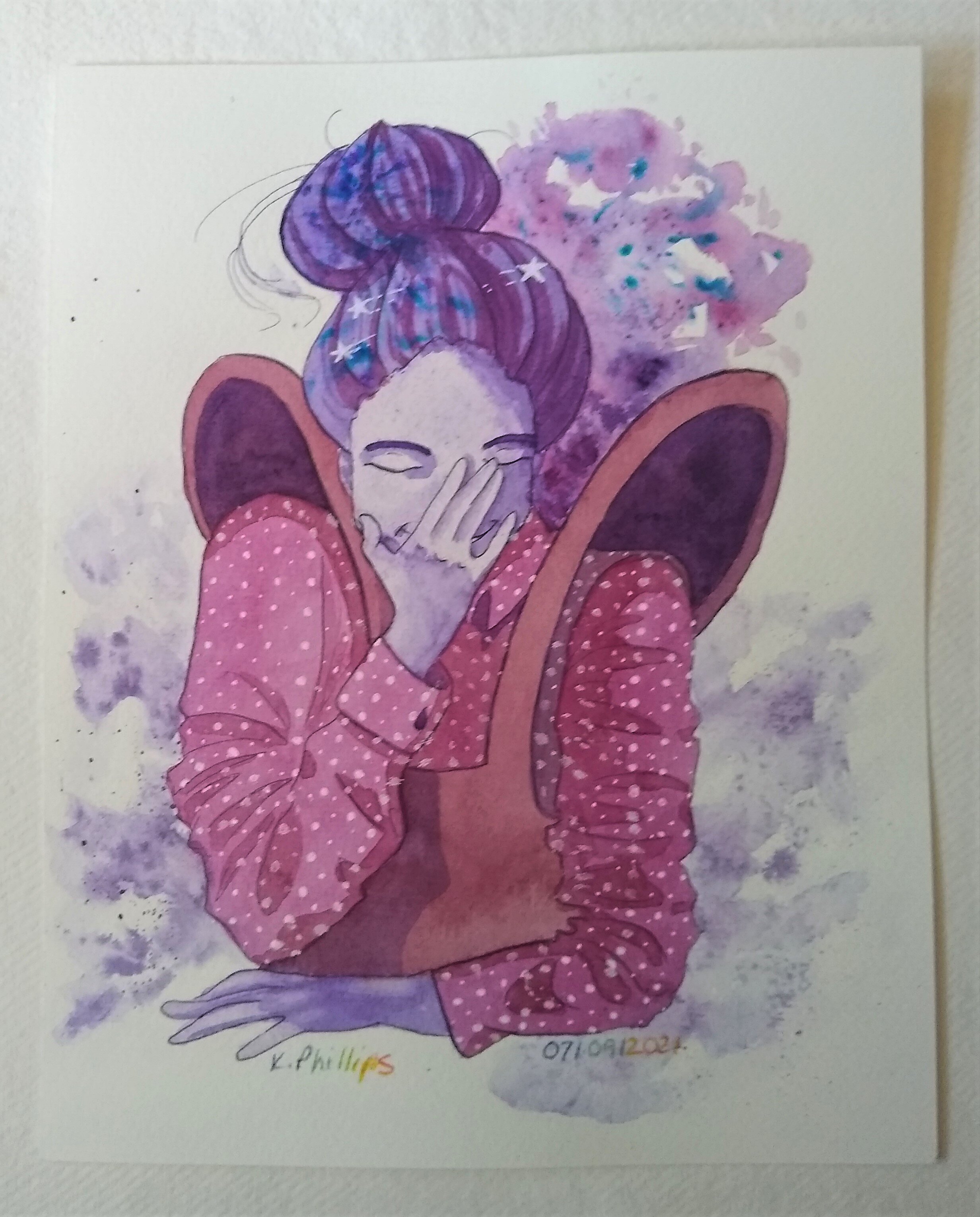
Shy Violet: Considered the problem solver, Violet is often reading, writing, or working out theories about color. She is as introverted as her name implies but will speak up if she can offer advice. I wanted to give the feeling of shyness on this model without being too submissive, so I found a pose where she is trying to hide a smile behind her hand. I combined Dioxazine Purple (M. Graham) with Quinacridone Purple (Daniel Smith) for her hair, finishing it off with some Ultramarine Blue Brusho pigment. Violet’s jumper is painted with Perylene Violet (Winsor and Newton), one of my favorite new colors. More Quin Purple for the shirt with white gel pen dots to create a pattern and introduce some contrast. Her skin was painted with granulating Ultramarine Violet (Winsor and Newton).

Rainbow Brite: Brave and motivated by color, the mascot for all things 80s uses her powerful rainbow belt to fight off murkiness and gloom. This model had the best pose and I had to give her a delighted, almost goofy expression. Since her hair, painted with one of each of the colors from the previous portraits, is so dramatic, sprayed with a spritzer bottle to fan out the explosion of color, I toned down the rest of the painting to solid blocks of color with the three primaries for the shoulder cuffs and tattoo. Our large lady doesn’t have a rainbow belt, but one covered in the star motif included on each character’s badge.
While these portraits aren’t very similar to the Hallmark designs, I rather like them because they improve on the sparse diversity and celebrate beauty in all faces and sizes. Rainbow Brite is absolutely a product of its time, but the idea of people being responsible for spreading color into the world is a great idea! In the future, I hope to revisit this idea again, but with male, trans male, and more non-binary portraits!