


Tecate has historically been a leading beer brand in Northern Mexico. The Tecate team wanted to build on this regional success and extend the beer’s popularity to all of Mexico, including a younger and more cosmopolitan Mexico City. To do this, they hoped to change the overall perception of Tecate as a stereotypical, ubermasculine beer to feel more relevant, progressive, and elevated without alienating its existing consumer base. In short, they wanted Tecate to become the most desirable beer in Mexico.
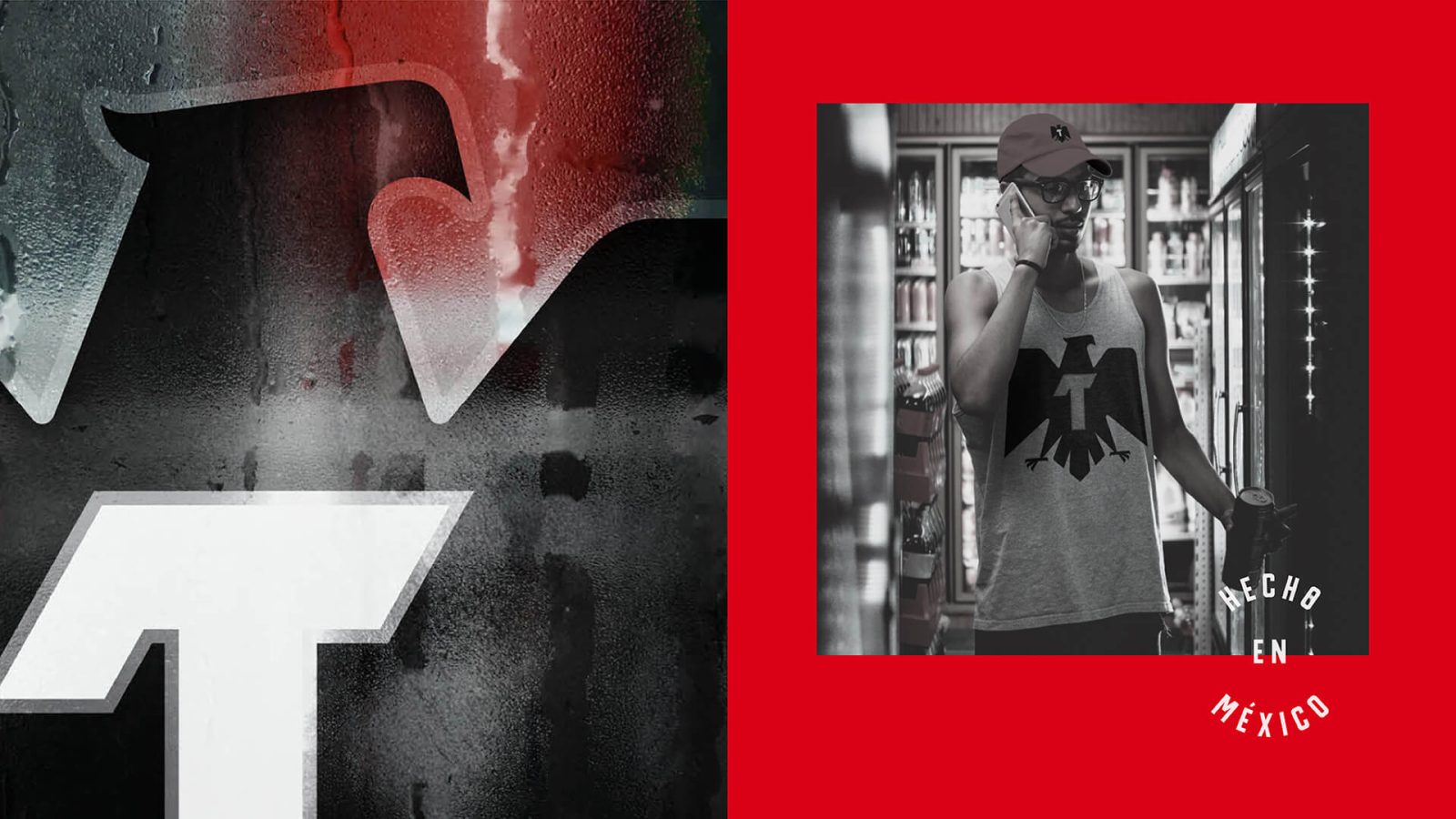
With a brand as beloved as Tecate, we knew that a boots-on-the-ground immersion across Mexico’s many regions would be necessary to inform a meaningful redesign. From this process, we gained a deeper understanding of the shifting cultural values, attitudes, lifestyles and behaviors of a new generation of Mexican men. Our consumer interviews and candid man-on-the-street conversations revealed a shared optimism, proud patriotism, and strong desire for community and camaraderie. With a predisposition for authenticity and inclusivity, our target demographic was eager to see their go-to beer brand evolve and progress, shedding the hackneyed male stereotypes and machismo storylines that once defined its identity.
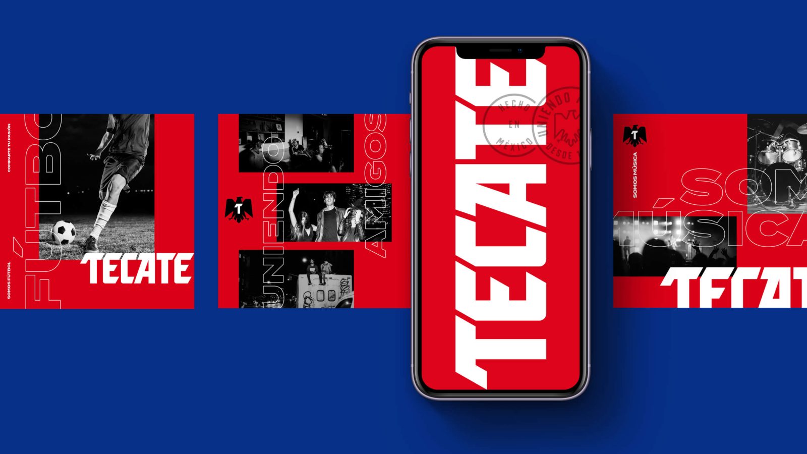
To attract this new generation of consumers, we encouraged the brand to think beyond the product – to see the rebrand as an opportunity to leverage their mass popularity and ubiquity in Mexican sports, music and entertainment. Instead of just selling products, the rebrand aims to create the community and lifestyle that these men seek, to represent their attitudes and interests, and ultimately to build a brotherhood of progressive pioneers.
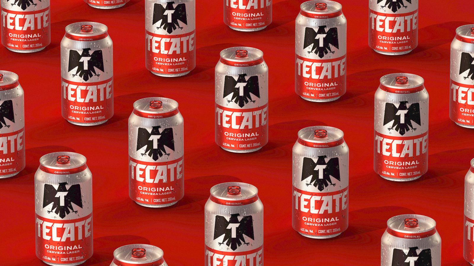
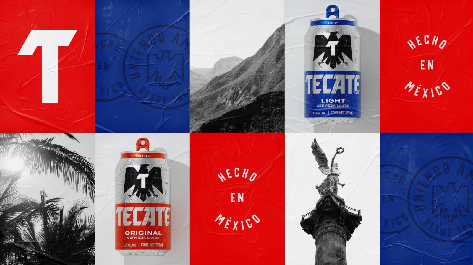
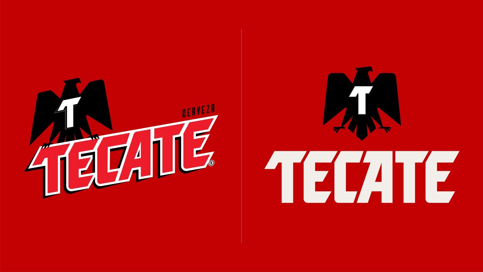
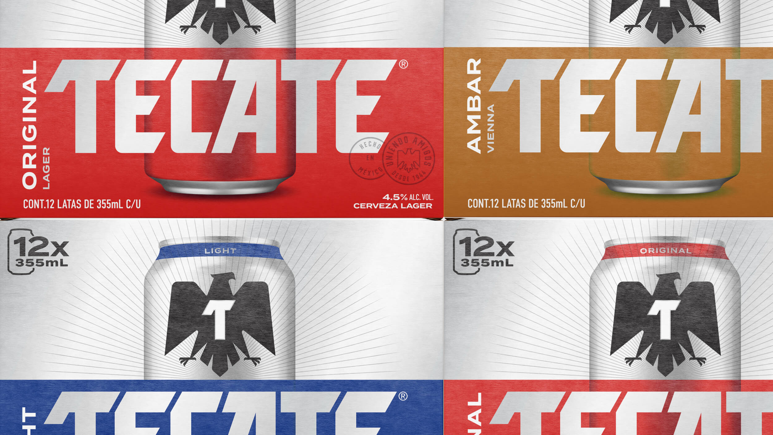
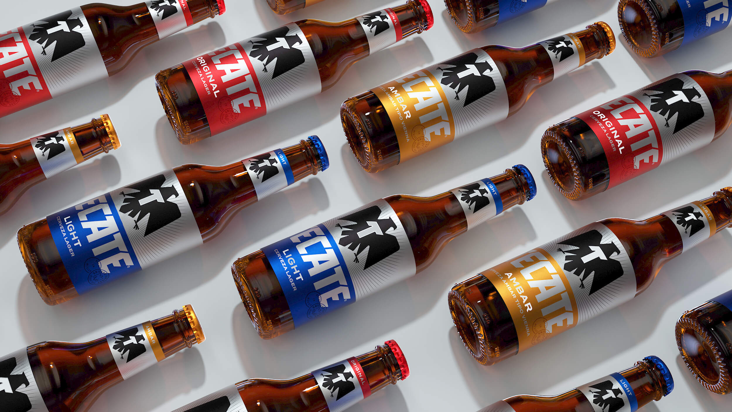
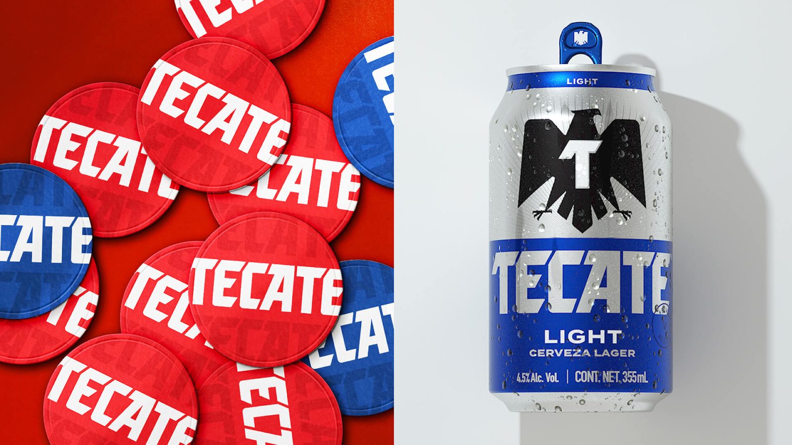
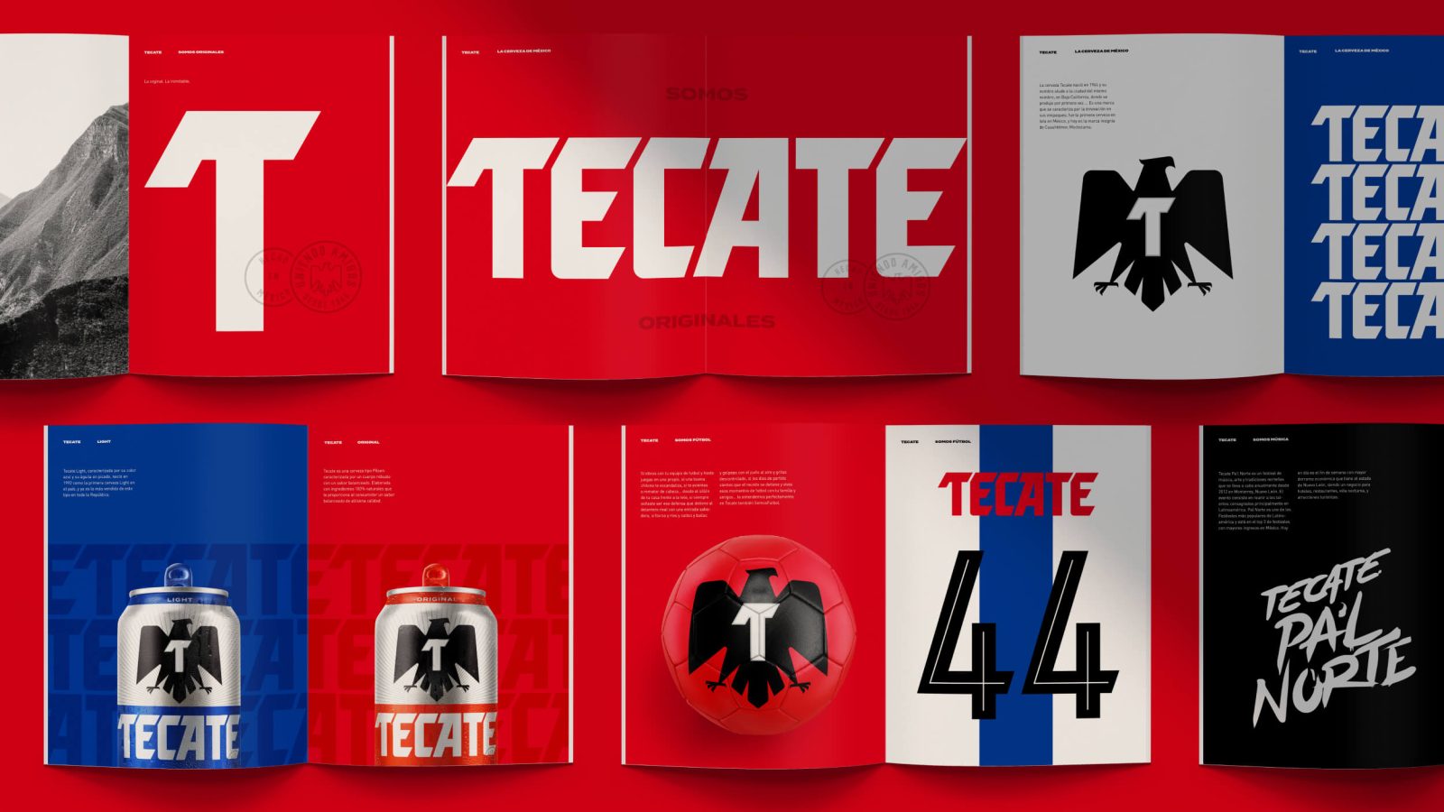
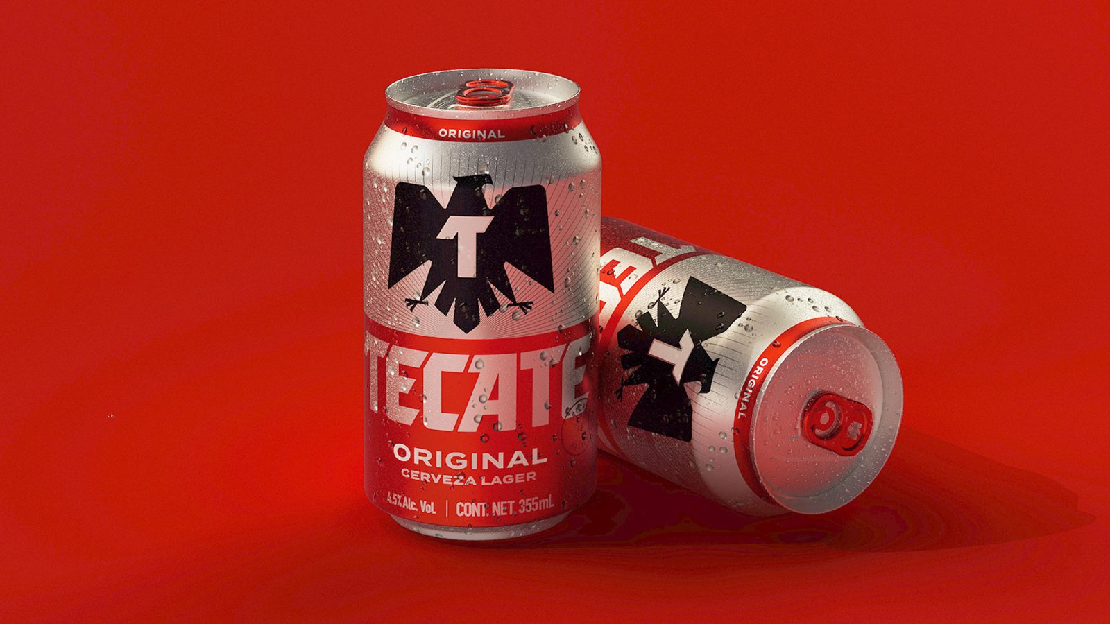
With these learnings in hand, we probed Tecate’s archives and traced its roots back to the city of Tecate in Baja California, Mexico, where the beer has been brewed since 1944. We revisited the brand’s most distinctive assets – emboldening the brand’s iconic eagle, a symbol of Mexican pride, and chiseled wordmark. In the name of authenticity, we stripped back any unnecessary visual clutter, cliche beer design tropes and exaggerated refreshment cues. The brand system establishes a fixed set of iconic assets – rooted in the brand’s heritage but crafted to accommodate portfolio growth, new products and innovations, sponsorships, ad campaigns, retail experiences and merchandising. The result is a cohesive brand narrative around the idea of Mexican brotherhood – it’s a story that propels Tecate to a modern lifestyle brand and continues to evolve with a national identity.
Following the rebrand, Tecate was able to secure a high-profile sponsorship opportunity with LIGA Mexico, the country’s top soccer league. This opportunity placed Tecate firmly in the hearts and minds of their target consumer, driving the need for impactful, stadium-ready brand activations and ad placements that rival the likes of Budweiser, Adidas and Nike. The full suite of assets and touchpoints developed by our team ensured that Tecate was ready to rise to the occasion, delivering the bold, unapologetic sensibility of the brand to the 3.5 billion soccer fans around the world.
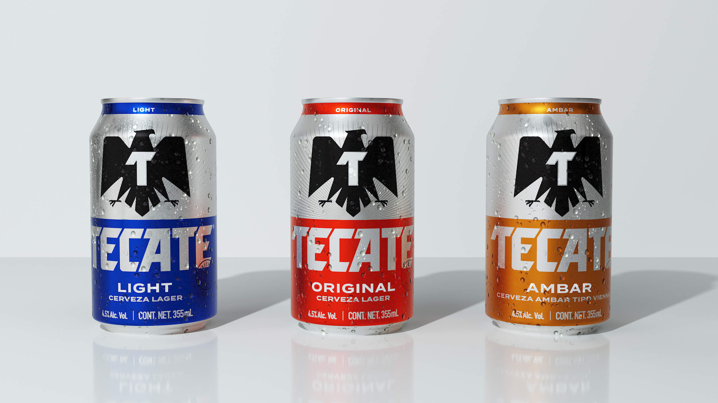
The new brand identity has allowed for the seamless introduction of Tecate Ambar, a new light beer that boasts the flavor of a robust, dark brew. This product diversifies the portfolio, providing a new option to meet the changing tastes of consumers, while maintaining the authenticity of the Tecate brand in a way that it is instantly recognisable on shelf and online. The extensive opportunities for growth within the Tecate business are also reflected in a new line of innovations we are developing for Tecate post-launch. Our fresh, new design has unified the ever-growing portfolio – inspiring the greater Heineken team to tackle new opportunities in the marketplace, driving the development of innovations in the beer category.
The rebrand has given Tecate a platform to promote a more inclusive, modern and respectful model of masculinity and positioned the brand to continue addressing some of the most pressing social issues in Mexico including underage drinking, gender violence and sustainability. In essence, Tecate is now a driving force in perpetuating positive change within Mexican communities by supporting and amplifying the shifting tastes of a younger, more progressive generation.

CREDIT
- Agency/Creative: Elmwood
- Article Title: Brand Redesign for Tecate by Elmwood
- Organisation/Entity: Agency
- Project Type: Identity, Packaging
- Project Status: Published
- Agency/Creative Country: United States of America
- Agency/Creative City: New York
- Keywords: WBDS Agency Design Awards
-
Credits:
Executive Creative Director: Meg Beckum
Design Director: Bruno Nesci
Design Director: Mike Table
Senior Account Director: Melissa Braun
Account Manager: Daniela Sabler
Senior Strategist: Robert Pietrzyk
Senior Designer: Jonathon Jones
Designer: Dee Dalencour


